This month at Viviprint we pushed out more of our hard-wearing labels and front panels on polycarbonate. Polycarbonate is a strong, flexible plastic that stands up to long term daily use. Logos, warning symbols and connector markings all go onto one clean, durable label. Here are two recent polycarbonate label jobs for manufacturers.
Power Interface Unit, Prototype to Production
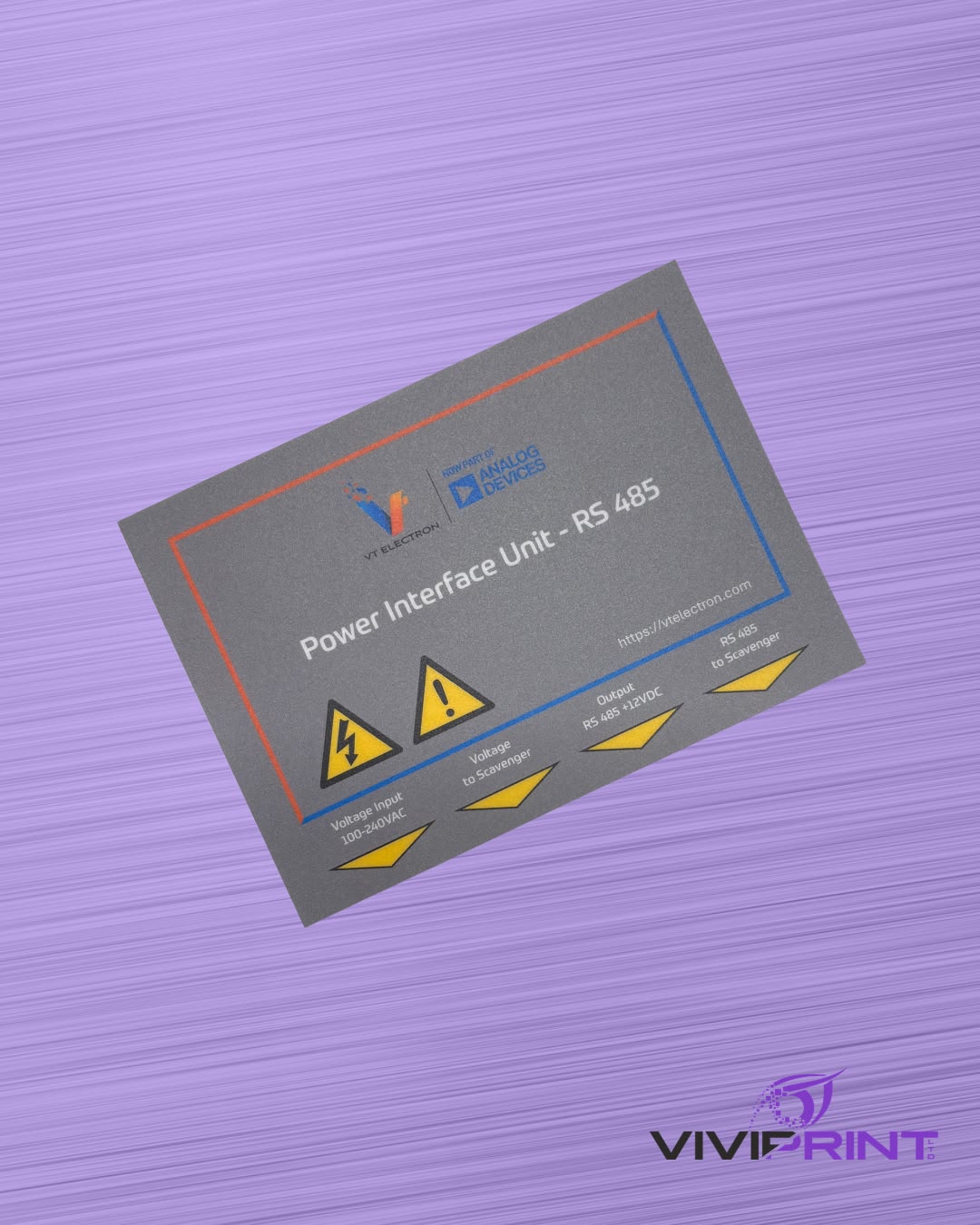
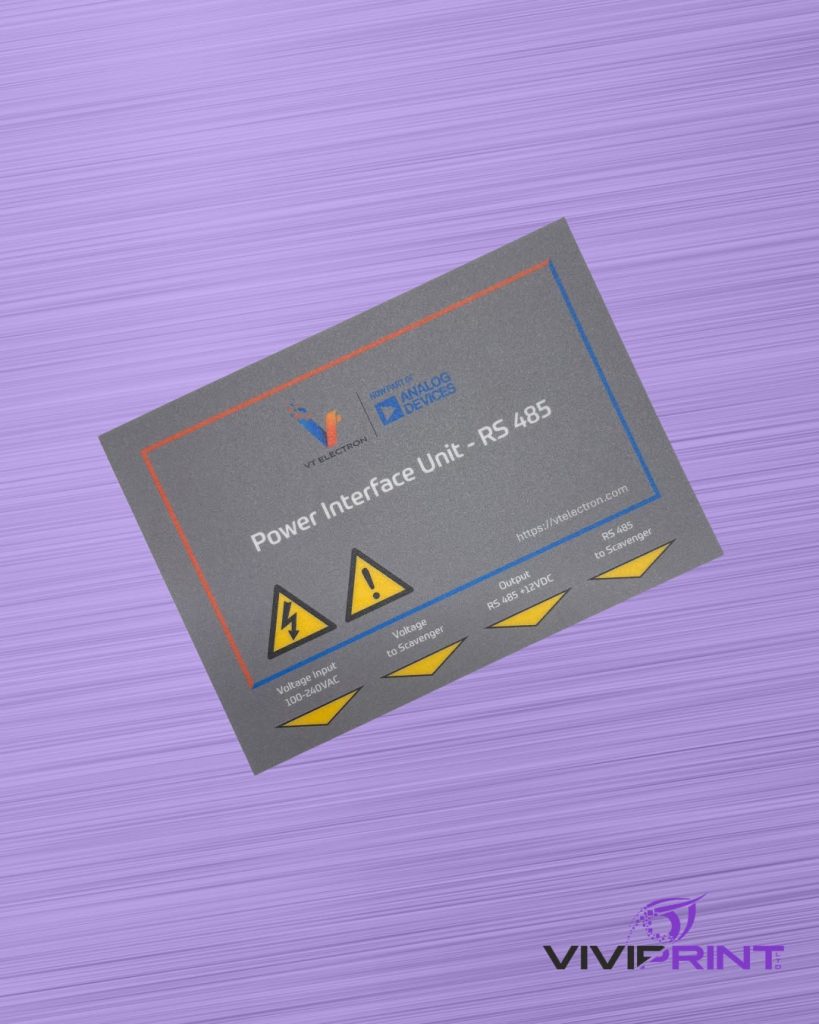
Firstly, we produced a sleek, nifty label for a power interface unit. It brings everything onto one label: the company logos, high-voltage and caution symbols, and clear markings for each input and output. We started with a prototype so the layout could be checked on the unit before the full run.
Black Box: A Full Batch of Front Panels
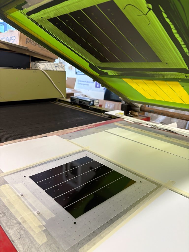
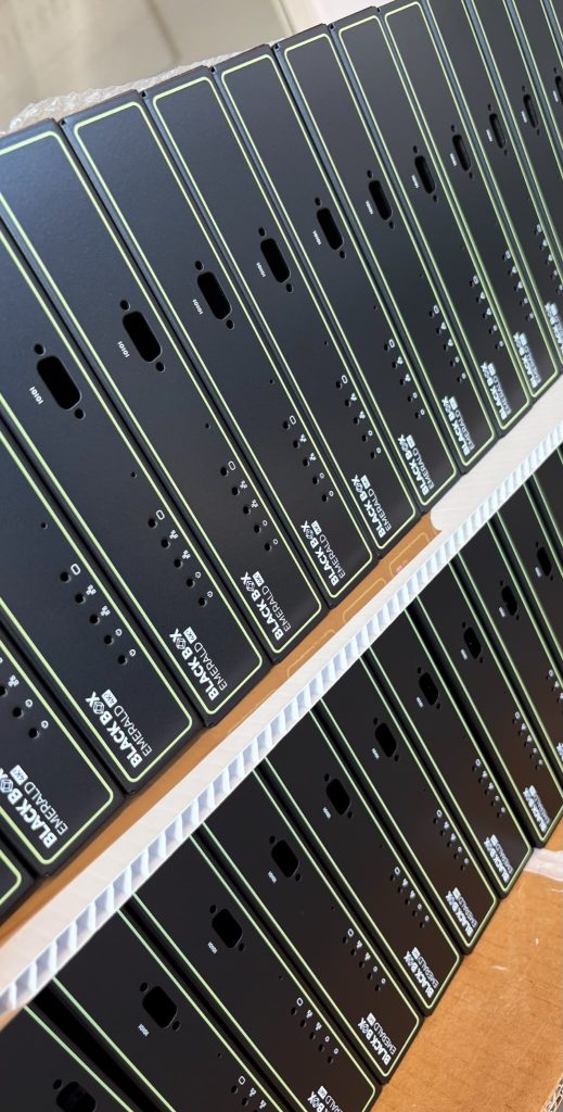
Secondly, we printed a big run of front panels for Black Box 4K units: the logo, product name, port icons and a fine green outline on a black finish. Here’s a look at them in production:
screen printing production run of black box front panels
Below is the end result – with a large batch, consistency matters. Every panel matches, and even the smallest icons stay sharp.
Why Polycarbonate?
Polycarbonate resists scratches, chemicals and wear, so labels stay readable for the life of the product. Colours stay bright, small text stays crisp, and it can be cut to any size or shape.
It works well for:
Front panels and fascias
Power and interface units
Machine and equipment labels
Warning and safety markings
Need labels for your products?
Whether it’s one prototype or a full production run, we’d be happy to help. Get in touch with the Viviprint team and tell us what you need.
Two jobs went through the shop recently that couldn’t be less alike if they tried.
One is a genuinely beautiful job to work on. A reverse-printed polycarbonate label with a sparkling silver finish that catches the light like something off a jewellery counter. It’ll spend its life on a medical device, being admired.
The other is a lockout tag. Red, loud, built to survive a plant floor. Its entire purpose in life is to hang off a machine and shout at people. Nobody has ever picked one up and said “lovely sparkle on that.”
We’ve started calling them the show pony and the workhorse. The funny thing about printing both in the same few weeks is realising they’re harder than each other in completely different ways.
The Show Pony
The medical device labels first. We can’t say who they’re for that’s part of the job. You do lovely work and then keep your mouth shut about it, but we can talk about how they’re made!
Reverse printing on polycarbonate is the standard for this kind of job, and for good reason. You print onto the back of the sheet, so the finished label is read through the material. The ink never gets touched. Not by cleaning chemicals, not by handling, not by ten years of daily use. The polycarbonate takes the beating so the print doesn’t have to.
Each sheet gets four passes through the press: black for the logo, then sparkling silver, then silver, then white behind it all.
The sparkling silver is the one that keeps you honest. Metallic inks love to drift, a bit more sparkle on this sheet, a bit less on that one and on a medical device, “close enough” isn’t a thing. Thankfully, our machine holds the sparkle dead consistent from the first sheet to the last, which is why we get this kind of work in the first place.
After printing, it’s into the two-stage heating oven, over the cooler, onto the racks to cure, then laminating adhesive and the die cutter. By the end, every label on the rack is identical to its neighbours. That’s the whole job, really.
The Workhorse
Then there’s the lockout tag, which nobody will probably ever admire and which we’d argue is the more important of the two.
If you’ve never worked around industrial machinery, when equipment is shut down for maintenance, a lockout tag gets hung on the isolation point. It’s the thing standing between the person elbow-deep in the machine and someone helpfully switching it back on. The front of the tag does the shouting “Caution, Point of Isolation, Do Not Interfere”. Back of the tag does the paperwork: the name and number of the one person allowed to remove it.
The job spec for these is simple but not easy. The tag has to stay legible through grease, rain, gloved hands and general abuse for the full length of the lockout. If the print fades, that’s not a quality complaint, that’s a safety incident waiting for a date. So the material is tough, the print is tougher, and the back panel takes a marker pen without smudging, because a tag with no name on it protects nobody.
What They Have in Common
One thing in common. Neither of them is allowed to be nearly right.
The show pony can’t have sheet number 40 sparkling differently to sheet number 4. The workhorse can’t have a warning that’s gone grey by August. Everything else about them is different: the materials, the finish, who looks at them, whether anyone looks at them at all, but the standard is the same, and it’s the standard we run the whole shop on.
If your project is a show pony, a workhorse, or something in between, give us a shout at www.viviprint.ie.